


From Traditional to Trendy: 2026 Color Palettes and Themes for Modern Indoor Playgrounds
By 2026, how an indoor playground looks matters a lot when it comes to bringing in new customers. Parents across America, particularly younger ones like Millennials and Gen Z, pick places that seem fresh, tidy, and great for posting online. A nice view doesn’t just please people - it spreads the word and brings them back again. Right now, looks do real work in ads and brands - they aren’t mere add-ons. This blog will explain how indoor playgrounds are moving from traditional designs to trendy 2026 color palettes and themes that create more engaging, modern play spaces.
Moving Away from Primary Colors: Classic vs. Trendy
Nowhere is fun louder than in old playgrounds, where red, blue, and yellow scream excitement. Yet those hues tend to look stiff, almost childish, today. Instead, newer spaces pick softer groups of color - on purpose, it seems. You might see them in living rooms or small shops. The feel? More like something you'd invite into your home. A sense of quiet rises where noise once lived. Soft light shapes spaces into something softer. This place feels lifted, not loud, with design choosing calm over clutter.
Top 3 Trending Color Palettes for 2026
In 2026, kids’ spots quit chasing animated ads and loud playsets. Experience matters more - little ones stay engaged even when grown-ups join in naturally. Color pauses just enough, textures knock slightly if touched, light shifts based on motion, never jarring. Folks slow down when they see it - something about the setup makes people stop before going inside. How things are arranged might nudge mood, nudge posts going viral online, and sometimes pull in crowds who didn’t come before.
Palette A: The "Earth & Nature" (Muted Greens & Toffee)
Light spills gently from muted shades, bringing the outdoors inside with stillness. Dull green blends into toffee tones - no fuss, just warmth that pulls children and adults close. Ideal perhaps when thinking matters like Earth or peace matter most. Outside sounds, leaves, or the way light moves through branches fit here. A quiet kind of warmth comes from real greenery, not just color. Smooth stone or thin strips of natural lumber add contrast without shouting. Something about it looks real, as if things were actually shaped by experience instead of planned.
Palette B: Modern Pastel (Dusty Rose and Sage)
A soft kind of charm shows up when pale pinks brush against gentle greens. Not too playful, yet still warm - this hue calms without pretending innocence. Snapshots often work well in this tone, perhaps since they seem like real life. Folks tend to linger longest where air moves quietly across skin. Comfort lingers just as strong after staring, especially if warmth stays behind the gaze. When rooms hum with noise, dim glow often stills thoughts like quiet rain. Anyway, it adds energy while never crowding the moment.
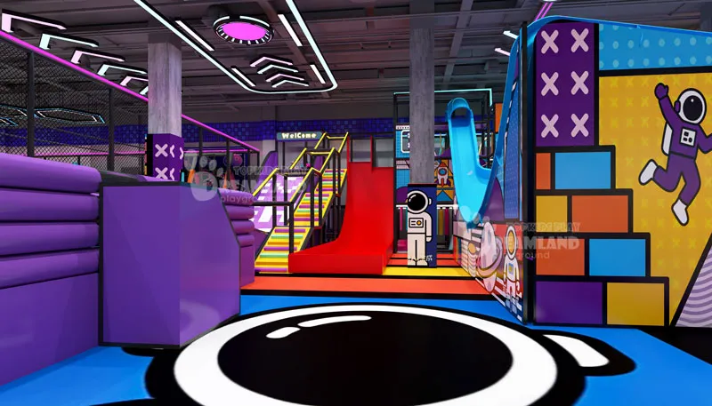
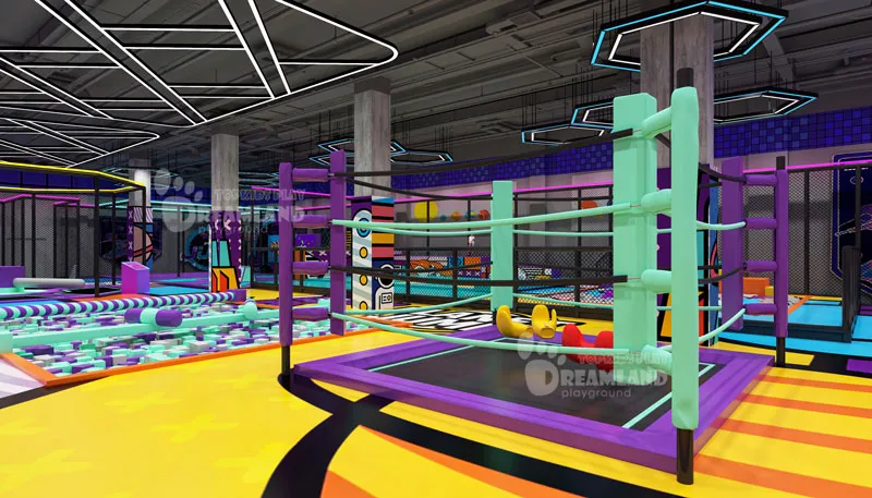
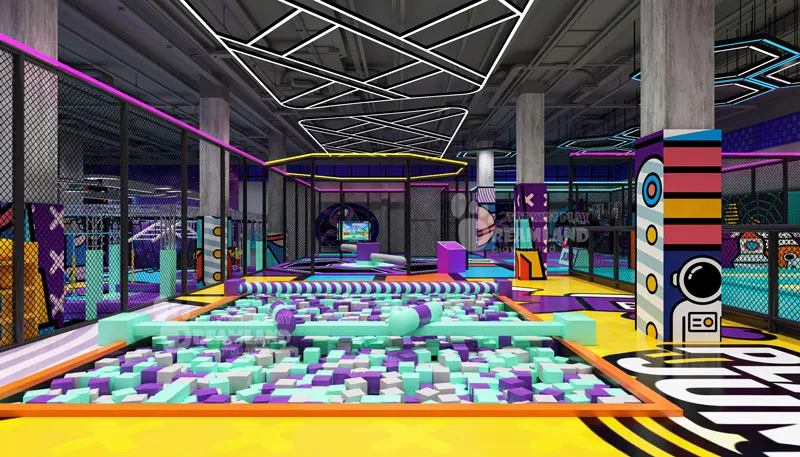
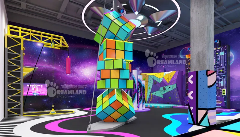
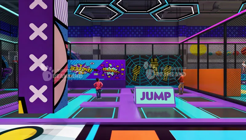
Palette C: The "Cyber-Sport" (Monochrome with Neon Accents)
Far from town, something made for teenage crowds crackles with life. Shaded by deep colors yet lit up with sharp bursts, it stands out. Imagine glow-in-the-dark game zones - places like indoor trampolines or high-voltage tag spots - where young adults tend to gather close. Bright neon slashes across dull tones - quiet yet impossible to miss. Ninja hideouts blend neatly beside chaotic playgrounds. Feeling shapes color choices; here, crisp borders stand clear, never fuzzing into blur. Neon lights up how things move, gives the area a lively feel, while also making photos stand out online.
Trending Themes for the Modern FEC
Trend #1: Shift from Traditional to Modern FECs
Nowhere is change clearer than in how FECs are reshaping their role. Once just basic arcades where kids played, they now unfold as rich experiences that draw families and adults alike. Built around innovation, shared moments, food, and themed spaces, these spots invite visitors to stay longer. Day after day, they become places people return to explore further.
Trend #2: Innovation in Game Technology
Out in the open, new tools such as VR/AR pop up alongside motion-sensitive play, while projection mapping and live-digitals grab attention. These shifts shake how people enjoy time. What draws visitors lately? Experiences that pulse with high-tech life, bringing grin along with quick phone posts later.
Trend #3: The Rise of Mall Entertainment
Nowhere is fun fading faster than in shopping centers now hosting full entertainment facilities. Foot traffic swells when these places blend play areas like arcades, virtual reality rooms, gaming cafes, and restaurants. The result? A new kind of spot where people linger longer than just browsing shelves.
Moreover, malls are becoming destinations again by offering more than just shopping. Entertainment like arcades, immersive experiences, pop-ups, and events give people a reason to stay longer. These spaces focus on fun, social connection, and shareable moments. The mall is evolving into a place to hang out, not just buy things.
Trend #4: E-Sports & Competitive Gaming Lounges
Teens and adults flock to dedicated e-sports arenas and gaming lounges. Live tournaments spark interest while leaderboards hum in the background, keeping things active. Streaming events unfold here,e drawing crowds back whenever new content arrives.
Trend #5: Immersive Themed Environments
Brands are transforming physical and digital spaces into fully immersive worlds that tell a story. Through cohesive design, sound, scent, and interactivity, customers don’t just observe—they participate. These environments deepen emotional connection and encourage longer engagement. The result is a memorable experience that feels more like entertainment than marketing.
Why Color Matters for Your ROI (Return on Investment)
Looks matter just as much as they influence behavior - how folks respond, move, or hand over cash. The colors selected could stretch out playtime for children, yet quietly shape what parents decide to allocate. Bright clutter overwhelms peace; thoughtful shades bring serenity while keeping things cozy. Something tangible emerges - extra income, guests feeling better, operations running more easily. Real progress shows itself here.
Increased Stay Time
Warm, gentle shades create stillness rather than noise, cutting down on tantrums when playtime begins. If children remain focused, grown-ups and other children tend to stay too, drawn by steady energy. Staying longer leads to bigger totals - more goods sold, including food, games, and sweet packages. What counts often shows through consistent daily earnings. Picking colors that match might even nudge things toward success.
Higher Party Booking Rates
A clean, stylish room tends to spark larger spending by caregivers. Pretty pictures online carry significant weight in drawing customers willing to pay more. Perceived value often follows what catches the eye first. Out there, people swap stories using their phones, no marketing needed. A fresh look does more than impress - it pulls fans back, then quietly draws in new ones.
Design Tips: How to Balance Playfulness with Sophistication
Feature Walls
One clear standout item - say, a high wall for climbing, a broad slide, or a main play area - lets bright colors lead without chaos nearby. People tend to pause right there, eager to capture memories held long. Beyond that center, softer shades leave room, skipping crowded angles so things stay uncluttered. When traffic follows paths made of walls, flow improves. These lines guide movement without clutter. Besides, walls create open zones where tasks unfold separately.
Lighting Integration
Colors shift under different lights. Warm glow on flat tones brings a sense of gentleness, pulling kids and grown-ups close to an area. Out in crowded areas - places like trampoline parks or tight obstacle paths - sharp neon lights blast forward without cluttering the space. One moment, a whole room glows, the next corner dims - this rhythm guides emotion, changes mood from area to area, yet quietly enhances every guest’s experience while on property.
Why Color Matters for Your ROI (Return on Investment)
Out at Dreamland Playground, it's not just about buying equipment - they build full visual ideas for you. Their design crew matches your brand look with the current 2026 shade and style shifts. Together, you can turn a space into something people actually enjoy being in—not just looking at. It’s all about thoughtful details, good vibes, and an experience guests want to talk about (and come back to). Standing apart becomes easier when the scene already points straight to you. By blending bold aesthetics with immersive storytelling, Dreamland helps bring your brand’s personality to life. What starts as an idea ends up measured by what it delivers.
Thinking of freshening up your playground? Get in touch with Dreamland Playground to talk through a one-of-a-kind 3D layout idea.
Frequently Asked Questions: Design Considerations
Do muted colors show dirt more easily than bright colors?
Not. Dreamland relies on high-quality vinyl and coatings - these resist stains and wash well. Bright, soft shades hold up when cleaned regularly.
Can I mix a traditional theme with a modern color palette?
Right. Take jungle or ocean - pair them with shades like olive, sand, or slate blue, then it feels known yet fresh. A familiar idea gets a modern twist without trying too hard.
How often should I update my playground’s color scheme?
Every five to seven years, a complete update happens by default. Soon after, small touches appear - like adjusted spacing or bolded highlights - to keep things fresh without waiting.
Will these trends work for both toddlers and older kids?
Right - zoning matters here. For little ones, pick muted shades that calm the space. In contrast, bold brights work well where energy runs high, like in ninja course or teen spots.
Can Dreamland show the palettes in 3D form somehow?
That’s right. With Dreamland, you get complete 3D previews - showing colors, lighting, and theme visuals up front. This helps check appearance early on.